The wedding colors that work best follow a simple logic: one neutral that leads, a second tone that supports it and an accent that gives the whole celebration its character. When a couple starts from that structure, and not from a list of favorite shades, the decor, stationery, flowers and photographs all look cohesive without effort.
The real problem is almost never a lack of ideas. Everything looks good on Pinterest, but in a garden in the State of Mexico, with midday sun and candlelight at dusk, the same color can look dull, too bright or out of place. That is why choosing a palette is a design decision that depends on the space, the light and the time of the event, and not only on personal taste.
This guide brings together seven combinations commonly used at Mexican weddings, explains how to adapt them to each venue and season, points out the shades to avoid and offers a step by step process to decide with confidence before hiring florists, linens and stationery.
Before looking at combinations, it helps to set three criteria that organize any decision: proportion, location and light. With those clear, ruling out palettes becomes much faster.
The 60-30-10 proportion splits color into three levels. The 60% is the dominant tone, almost always a neutral like ivory, cream or sand, covering linens, walls and backdrops. The 30% is the secondary color, present in greenery, flowers and napkins. The remaining 10% is the accent, reserved for candles, stationery, ribbons or a metallic detail.
A wedding with 150 guests and 15 tables of 10 shows how it works. Those 15 tables can have ivory tablecloths, napkins in the secondary color and a single accent at each place setting, like an amber candle or a name card. The table looks orderly, the color repeats without overwhelming and every vendor knows exactly which shade is theirs.
A palette works when it speaks to its surroundings. In a garden with dense vegetation, the greens already provide the background color, so the decor can rely on warm neutrals and a single accent. In a hall with light walls there is more room for deep tones like navy or plum.
A mountain setting like Malinalco, in the State of Mexico, calls for palettes that respect the stone, the wood and the green of the landscape. Colors that look like part of the place appear natural in photos, while those that compete with it look like an added layer.
The same shade looks different at 1:00 p.m. than at 7:30 p.m. The Diario de Yucatán article 5 combinaciones de colores en tendencia para bodas (in Spanish) recommends checking samples in both natural light and warm candlelight to confirm they do not shift. At a wedding with a sunset ceremony and an evening reception, that test avoids surprises like a blush pink that turns salmon or a sage green that dulls under yellow light.
The following palettes combine neutrals, a secondary tone and an accent, and they suit both a religious ceremony and an outdoor reception. Each one includes how to apply it and the setting where it shines most.
This is the elevated version of classic romance. Ivory works as the base in linens and floral arrangements, blush pink appears in seasonal roses or porcelain tableware, and matte gold is reserved for flatware, candleholders and small metallic details. It looks beautiful in chapels and halls with light walls, where the delicacy of the whole is appreciated up close.
This is an organic palette that blends into gardens, haciendas and vineyards. Cream and beige textiles serve as the base, while sage and olive green foliage brings freshness and serenity. Since the surroundings already add greens, the accent should be very discreet, for example an amber candle or a textured white flower.
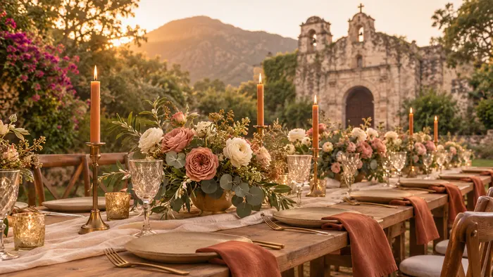
This combination brings the warmth of sunsets to the table. Ivory and sand support the linens and the bare wooden tables, and terracotta is concentrated in autumn flowers, handmade ceramics and napkins. Trend reports on orange and terracotta at 2026 weddings (in Spanish) explain that this family of tones is gaining ground over gold and silver when mixed with linen and natural textiles.
This is a serene option for daytime weddings. Dusty blue leans on warm neutrals like sand or linen, and gains depth with wood and natural fibers. It is an elegant alternative for couples who want to move beyond pink and green without losing softness.
It offers a formal, evening contrast. Navy brings seriousness in textiles and tailoring details, white cleans up the whole look and dense green foliage adds freshness. It works especially well at black tie receptions that stretch into the night, with warm lighting and candles.
This is a deep palette that is no longer limited to winter. Plum and burgundy are concentrated in flowers and napkins, while cocoa appears in wood, ceramics and stationery. To keep photos from looking heavy, it helps to keep a light base like ivory or cream and spread the dark tones in small proportions.
This is a soft trio for romantic, timeless ceremonies. Champagne acts as a luminous neutral, lavender adds a fresh touch and blush softens the whole. It is a great choice for afternoon weddings, when golden light enhances pastel tones without dulling them.
| Palette | Mood | Best setting | Suggested accent |
|---|---|---|---|
| Ivory, blush pink and matte gold | Classic romantic | Chapel or hall with light walls | Gold candleholders |
| Sage green, cream and beige | Organic and serene | Garden, hacienda or vineyard | Amber candle |
| Terracotta, sand and ivory | Warm, sunset feel | Outdoor afternoon ceremony | Handmade ceramics |
| Dusty blue and warm neutrals | Relaxed and elegant | Daytime wedding | Wood and linen |
| Navy, white and green | Formal and evening | Black tie reception | Candles and dense foliage |
| Plum, burgundy and cocoa | Deep and enveloping | Evening reception | Wine toned flowers |
| Champagne, lavender and blush | Soft and romantic | Afternoon ceremony | Lavender stationery |
To see how each palette behaves with real stone, wood and vegetation, it helps to walk through a wedding venue near Mexico City at the exact time the ceremony will take place.
This order avoids redoing decisions and keeps every vendor aligned from the start.
Not every shade that looks good in person looks good on camera. According to a TV Azteca piece on colors that look dull in wedding photos (in Spanish), neon tones like orange or yellow, intense fuchsia and reddish orange lose intensity in front of the lens and steal attention from the rest of the scene. By contrast, the same piece mentions that pearl, ivory, bone and champagne work as delicate bases, with touches of emerald, rose gold or blue for depth.
There is an important nuance with orange. While neons look dull in photographs, terracotta, amber and sunset versions are among the 2026 trends, as long as they are mixed with neutrals and used in small doses. The difference lies in saturation and proportion.
Wedding colors also extend to the people attending. It helps to include a short note in the dress code asking guests to avoid white and black, along with shades that compete with the palette, so group photos look harmonious.
As an exercise, imagine Valeria and Andrés, a fictional couple planning a wedding for 150 guests in Malinalco, with a ceremony at 5:00 p.m. and an evening reception. Their starting point is not a favorite color, but the place: stone, wood and green mountains.
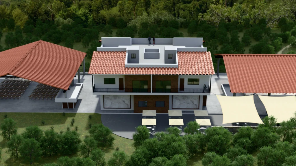
At a venue like Gran Malinalco, which spans 9 hectares (about 22 acres) of gardens and nature and has a private chapel, the natural base is already green and stone. So the couple chooses ivory as the 60% (linens and floral arch), sage green as the 30% (foliage and napkins) and terracotta as the 10% (amber candles, stationery and one ceramic detail). Exclusive rental of the venue means the decor does not compete with another event and the couple can test samples in the garden, at the real time of the ceremony, during a visit planned without rush.
For the reception, the event hall with warm light reinforces the terracotta and the amber of the candles. Included lodging lets family members arriving from Mexico City, about 90 minutes away, experience the full palette from the afternoon before, even in the welcome details. The result is a celebration that feels cohesive from start to finish, without needing to add dozens of colors.
Three works best: a base neutral, a secondary color and an accent. That structure lets you repeat the color in flowers, linens and stationery without overloading the decor. A fourth tone can work if it is a variation of the secondary color, but more than four tends to fragment the look and complicate vendors' work.
Recent trends point to terracotta and orange in soft versions, olive and sage green, dusty blues, deep tones like plum and burgundy, and warm neutrals like sand, linen and ivory. Gold and silver are still present, but more and more as a detail and less as the star. The best approach is to choose a trend that also matches the venue.
Palettes that speak to the landscape tend to be the safest: sage green with cream and beige, terracotta with sand and ivory, or dusty blue with warm neutrals. In the State of Mexico, where vegetation already provides background greens, a warm neutral with a single accent works better than adding more greens. It is always a good idea to test samples on site, at the time of the ceremony.
Neon tones, like orange or fluorescent yellow, intense fuchsia and reddish orange tend to lose intensity and steal attention on camera. It also helps to watch white and black in guests' clothing. Bases in ivory, pearl, bone or champagne, with accents of emerald, rose gold or blue, usually photograph better.
The palette that ages best in photos is not the newest one, but the one that grows out of the place and the light of the chosen day. With a base neutral, a secondary tone and an accent tested under real conditions, the decor holds up in photographs, video and memories, and vendors work from a clear guide instead of guesswork.
Couples planning their wedding near the capital can see it in person before deciding: walk the gardens, see the chapel at the time of the ceremony and compare samples with the landscape in view. To schedule a visit to Gran Malinalco and see how your palette would look in a 9 hectare space with a private chapel, event hall and lodging, simply reach out to the venue team.
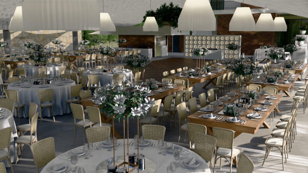
With accommodations for over 200 guests, a chapel, an event hall, and a private estate nestled in the natural surroundings of Malinalco.